Client
Smeg Professional
Sector
Professional appliances
Year
2025
In professional environments, good design often goes unnoticed. You feel it in how smoothly things work, how machines respond, and how nothing interrupts the flow. That’s where beauty lives. And that’s what we set out to reveal for Smeg Professional. Our role was to bring their communication up to the same standard as their appliances: refined, precise, and made to perform.

A strong foundation, shaped into structure

_______
Smeg Professional is known for its reliable, high-performance appliances. What it needed was a brand framework with the same clarity. We developed a visual and verbal identity that unifies its presence across tools, channels and markets, structured, coherent, and built for consistency.

Communicating the performance

_______
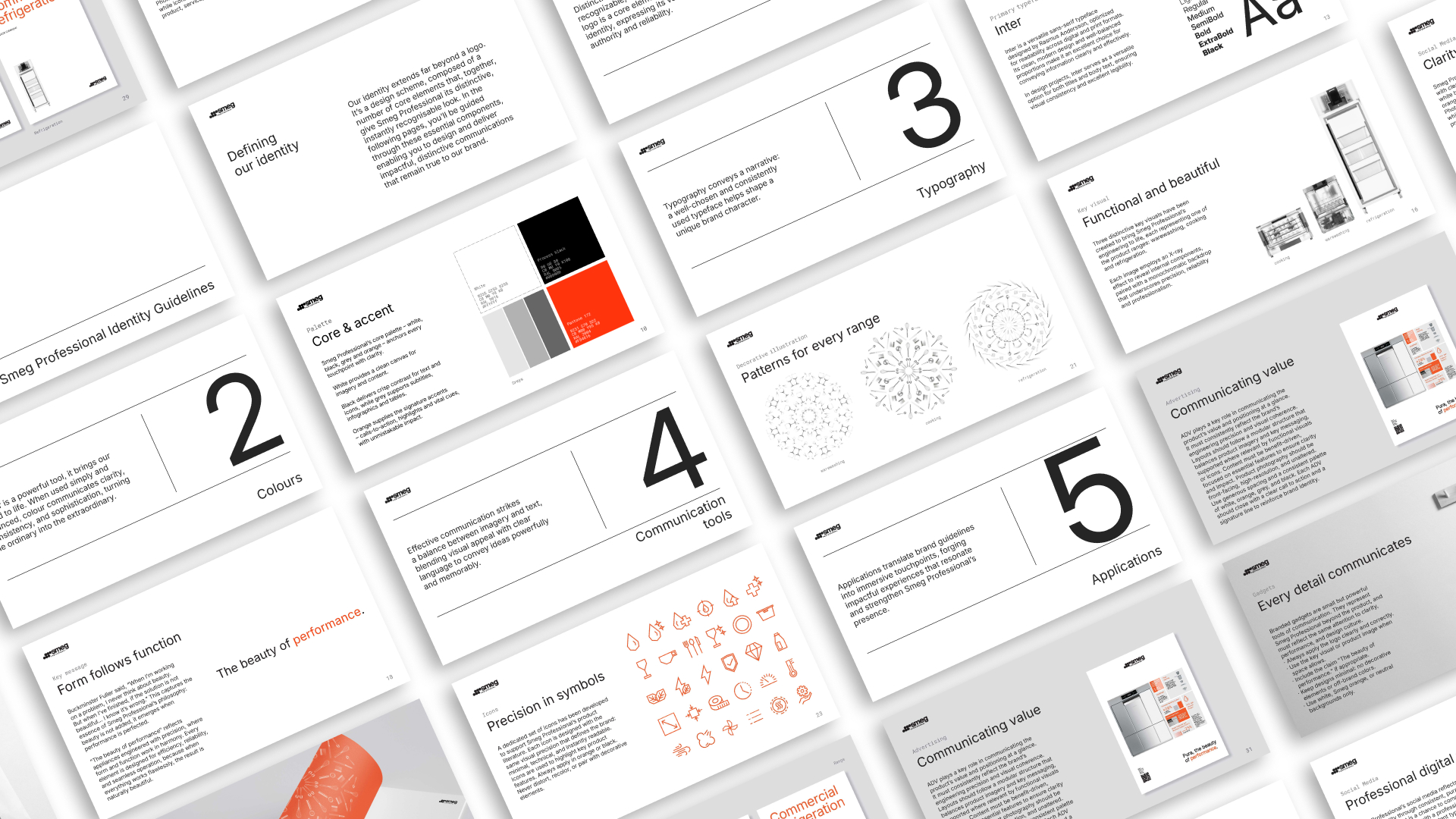
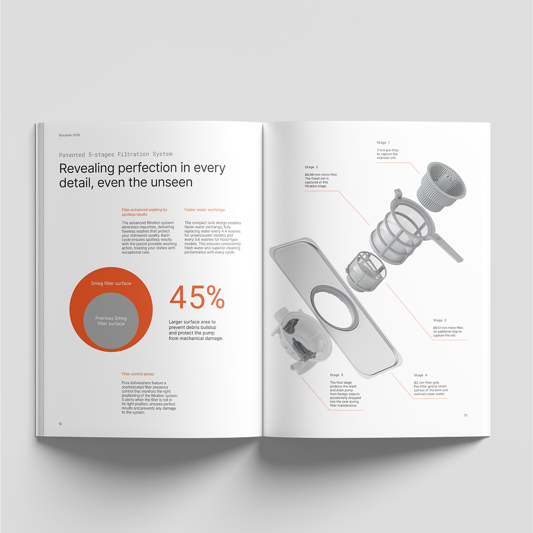
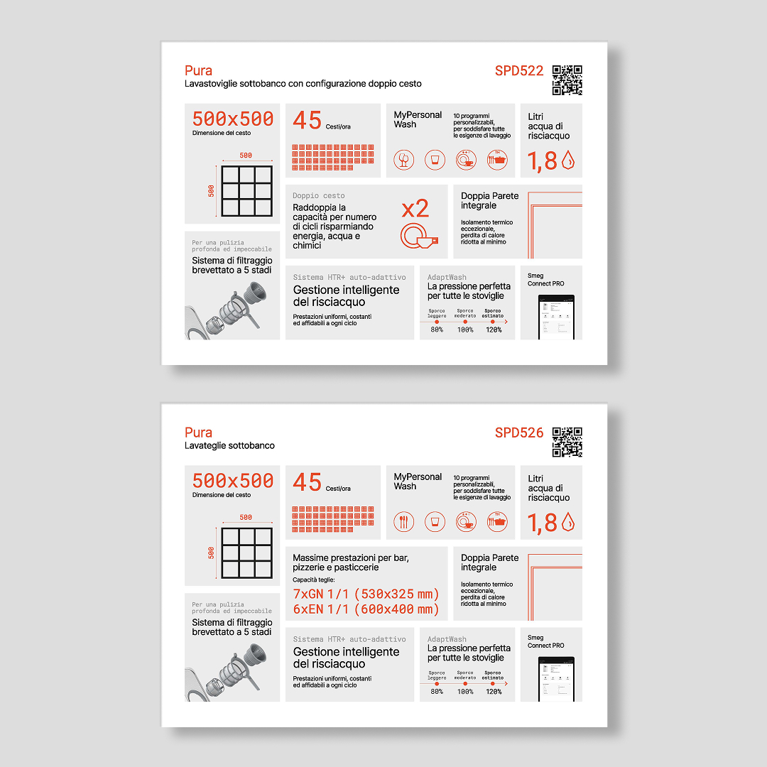
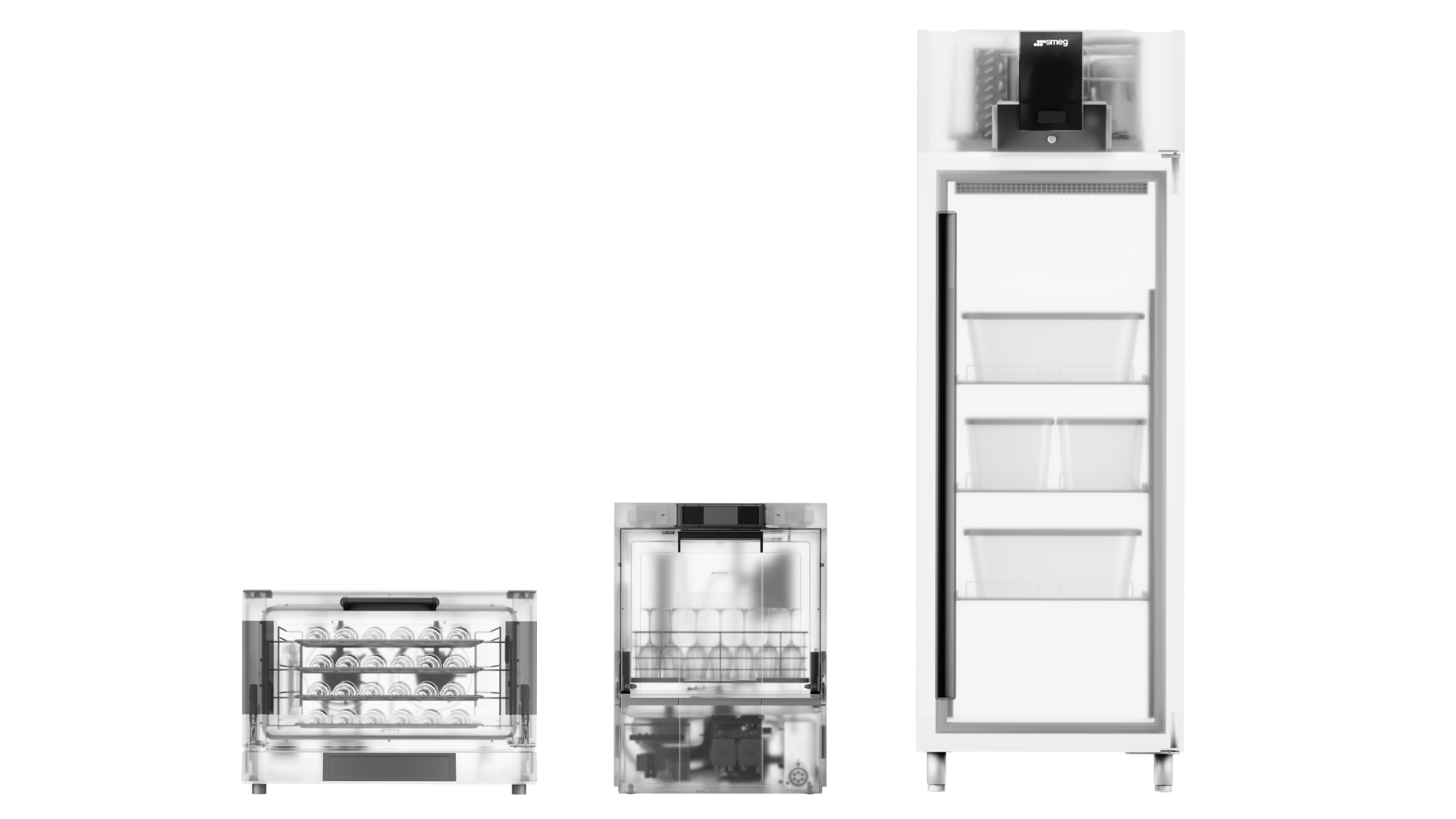
At the centre of the new identity is a key visual, a technical, X-ray-style rendering of each appliance: dishwashers, ovens, refrigeration units, showing the internal logic that drives them. Each image communicates exactly what makes these machines exceptional. From this concept came the brand claim: The beauty of performance. A simple line that expresses both the precision of the design and the quiet confidence of how it all works.Smeg Professional is known for its reliable, high-performance appliances. What it needed was a brand framework with the same clarity. We developed a visual and verbal identity that unifies its presence across tools, channels and markets, structured, coherent, and built for consistency.

The everyday becomes part of the system

_______
We created a series of illustrations featuring the tools used around the machines: pastry instruments, bar accessories, kitchen utensils. These visual elements bring context and familiarity to the system. Now used across brochures, exhibitions and internal materials, they support the identity with rhythm and relevance.

Visualising machines in working environments

_______
Our approach to product rendering focused on realism. Each machine is shown in a professional context, within a kitchen, at the heart of a preparation area, or in a service zone. The result is less abstraction, more accuracy, and a clearer connection between machine and environment.

Built to move, designed to align

_______
We extended the identity into physical space through a modular trade fair system. Designed for reuse across formats and geographies, it ensures visual continuity while adapting to different scales. Every configuration retains the same structure, tone and visual discipline.

A digital platform that reflects the same thinking

_______
We carried the same principles into the new Smeg Professional website. The navigation is clean, the content is purposeful, and the experience is shaped around the needs of professionals. It communicates with efficiency, supports real decisions, and expresses the identity without decoration. We developed a suite of videos to support launches and exhibitions. Structured, concise and visually aligned, these films extend the brand into movement. They present information with the same control and confidence that defines every other part of the system.
The identity we created is rooted in the way Smeg Professional designs and builds. Every visual and verbal element reflects the same measured intent. There’s no noise, no excess, just a brand that operates with the same precision as the machines it represents.