Control without the manual
Client
Normann
Sector
Blast chillers
Year
2025
Normann’s blast chillers are used by a range of professionals, some wearing chef’s jackets, others working the fish counter in a supermarket. The challenge: design a user interface that works for both. Not a stripped-down touchscreen or a port of a legacy menu system, just a genuine rethink of interaction. A UX language tailored for industry, yet built on the habits of everyday technology.

Learning from where fingers already go

_______
Rather than inventing a new way of thinking, the interface borrows from existing ones, namely, the smartphone. Interactions echo what most users already do instinctively: renaming a recipe feels like renaming a file; grouping functions works like dragging apps into a folder. The design avoids overcomplication by drawing on familiar patterns and micro-interactions, helping first-time users feel at ease without sacrificing depth for experienced operators.

Structure without stress

_______
Work began by mapping every required action, from launching a rapid chill cycle to customising a recipe. Flows were built, refined, and reviewed in close collaboration with Normann’s team, resulting in an information architecture that’s logical, linear, and adaptable. The interface makes no assumptions about the user’s expertise, whether it’s Mario from the supermarket or a seasoned pastry chef, the experience remains consistent and approachable.

Tested where it matters

_______
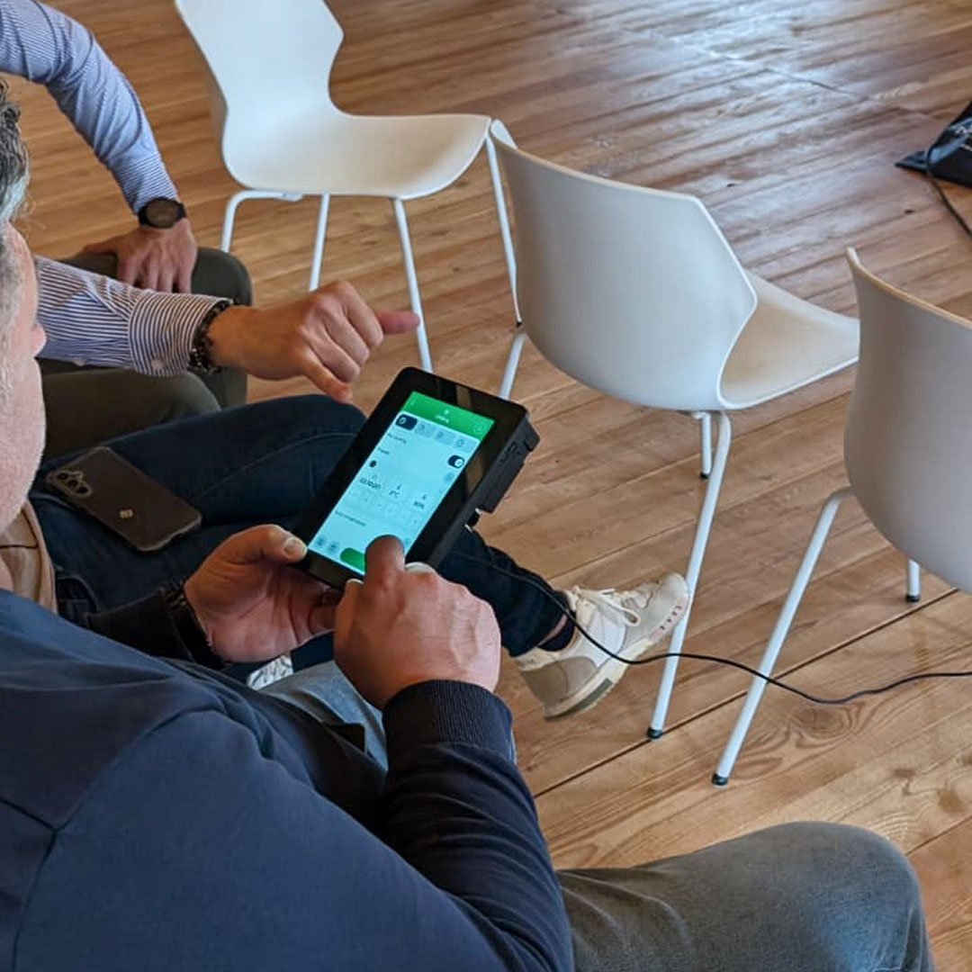
Once core flows were mature, the project moved into validation. A focus group was conducted in a working kitchen, with a mix of chefs and operators testing real scenarios: starting a programme, modifying a cycle, creating a recipe. Feedback was honest, detailed, and occasionally sharp. The interface was revised accordingly, with tweaks to both the flow and the UI, nothing theoretical, all field-driven.

A UI that knows its place

_______
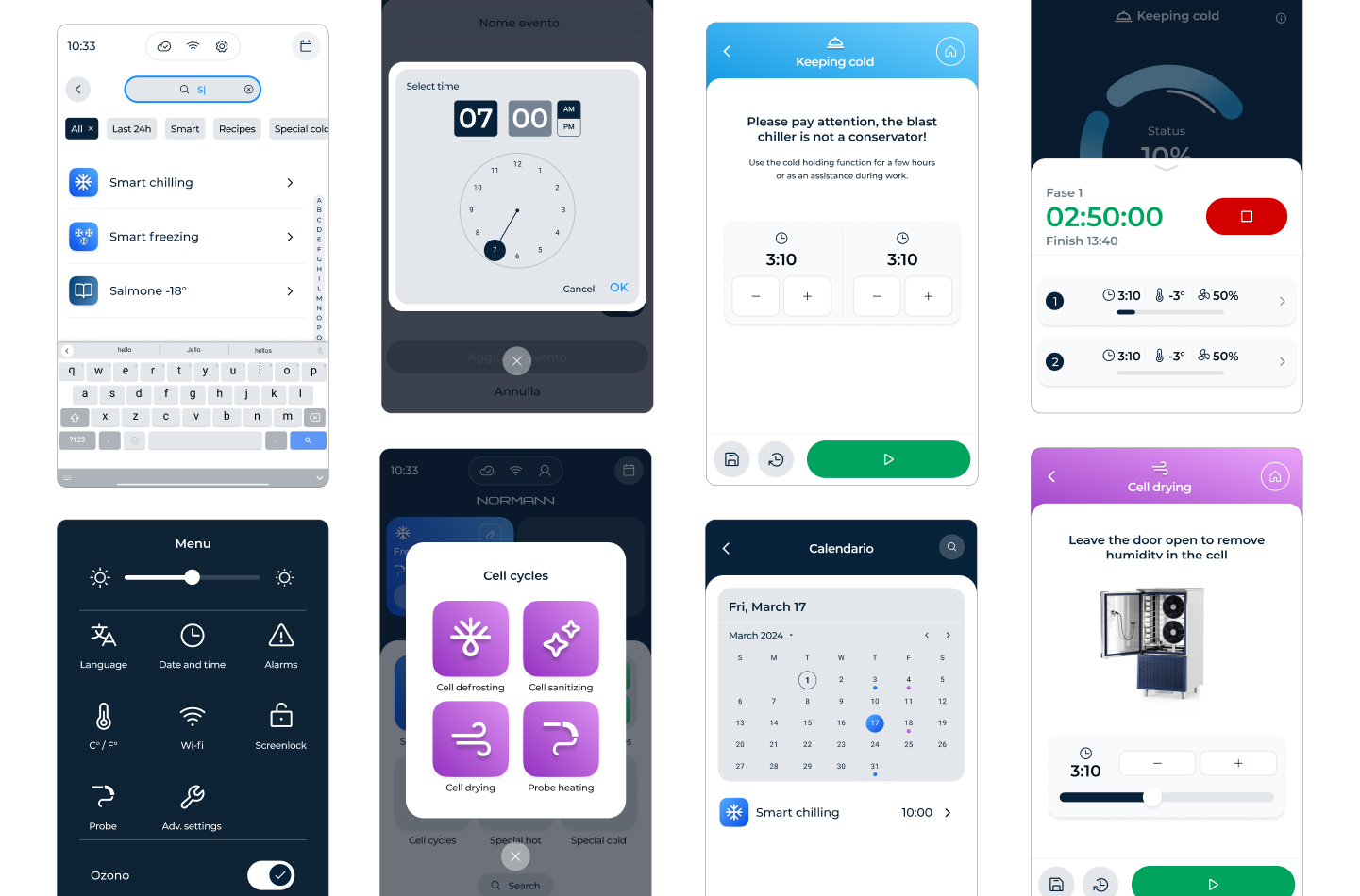
The visual system was designed to be recognisable and contemporary without leaning on clichés. Colour acts as a functional guide, with each cycle type assigned a distinct hue that follows the user through the process. Cold cycles in blue, warm cycles in orange: basic, but behaviourally effective. Animations are used sparingly and purposefully: enough to indicate system status from a distance, subtle enough to feel native.

Icons were custom-designed, with soft gradients and tactile depth— somewhere between Android and iOS in mood, never tipping into trendiness, for a clean, readable, and quietly expressive result.

Built to work, and built to last

_______
What began as a control panel redesign became a full UX ecosystem, complete with visual rules, interaction behaviours, and developer-ready documentation. A digital environment that mirrors the physical rigour of Normann’s engineering, while keeping the human at the centre of it. Not flashy. Not overdone. Just clear thinking, turned interface.