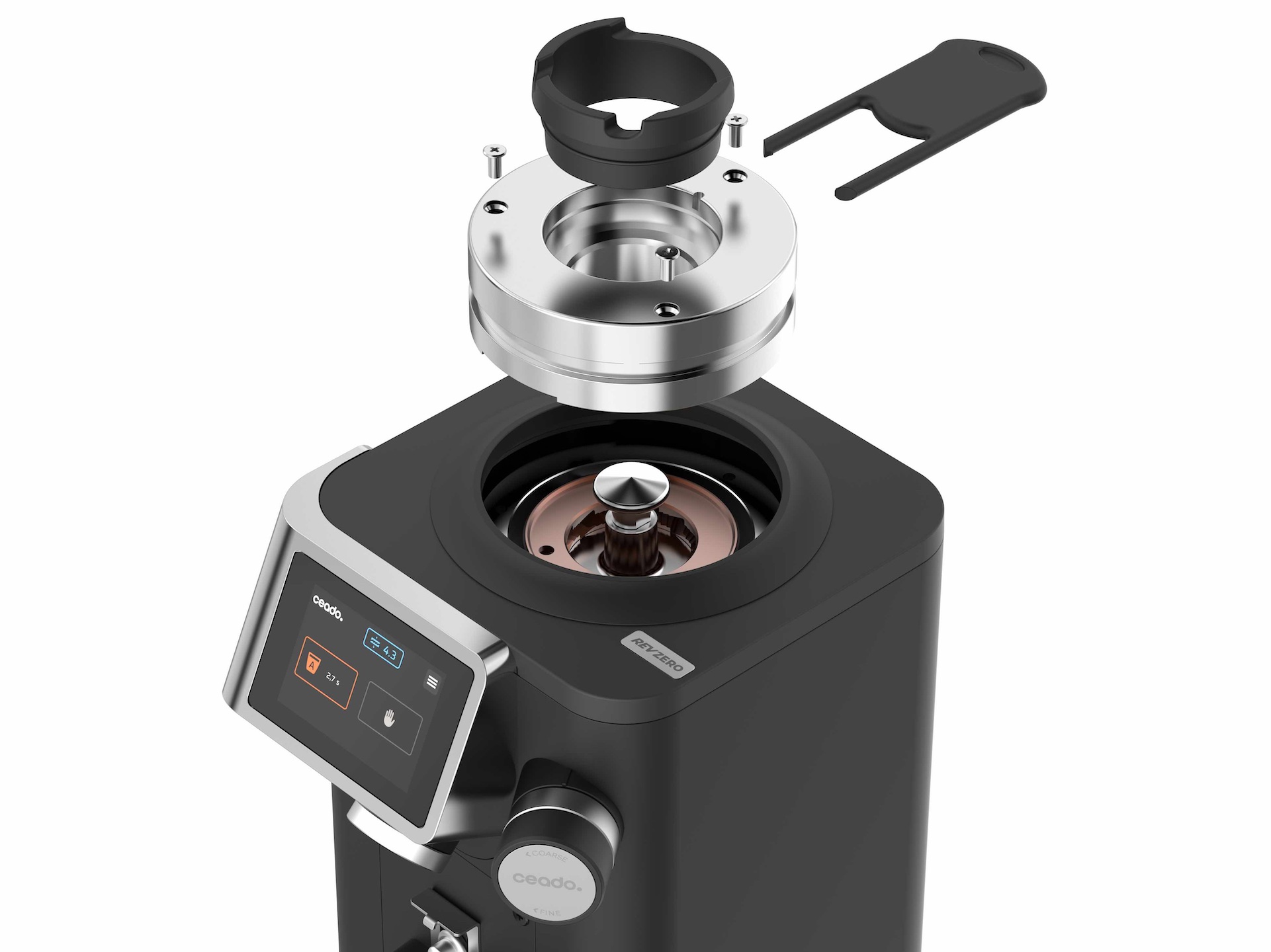
Interface for professionals, not passers-by
_______
On the UX/UI side, we took the same approach: clarity over clutter. REV’s interface was crafted for professionals who know their beans and their grind, not casual passers-by. Flat graphics, bold orange accents, and a modular layout let baristas save and switch between key doses—single, double, long, or manual—without breaking their rhythm. Adjustments like grind calibration are displayed live, making complex tasks simple, even in the chaos of a busy bar.